Starbucks - Redesign: Um novo olhar sobre um ícone global | A new look at a global icon
PT: Este é um projeto de redesign da marca Starbucks oportunizado pelo concurso da Jornada da Identidade Visual da Design Academy. Meu objetivo foi resgatar a história de como tudo começou e retratar tudo que foi construído desde então, mantendo a essência e conceito da Starbucks, que é mais que uma cafeteria, é um ponto de encontro onde o aroma do café se mistura com a essência da conexão humana.
O símbolo é composto por elementos similares ao logo original acrescentando a baleia cachalote, personagem mitológica do livro Moby Dick em que o nome do primeiro homem a embarcar no navio do livro era Starbuck, dando origem ao nome da marca.
O logotipo mescla letras minúsculas e maiúsculas, remetendo à diversidade, conforto e humanização, sem perder a confiança e presença conquistada pela marca. As ilustrações trazem otimismo, ânimo e reconhecimento e retratam elementos importantes da história e serviços oferecidos pela cafeteria, enquanto a tipografia escolhida torna a comunicação clara e acessível. A paleta de cores retrata a experiência que celebra a diversidade, a comunidade e o prazer de desfrutar um bom café em boa companhia.
___
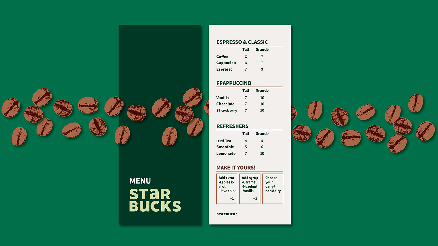
EN: This is a redesign project for the Starbucks brand made possible by the Design Academy competition. My goal was to rescue the story of how it all began and portray everything that has been built since then, maintaining the essence and concept of Starbucks, which is more than a coffee shop, it is a meeting point where the aroma of coffee mixes with the essence of human connection.
The symbol is made up of elements similar to the original logo, adding the sperm whale, a mythological character from the book Moby Dick in which the name of the first man to board the ship in the book was Starbuck, giving rise to the brand's name.
The logotype mixes lowercase and capital letters, referring to diversity, comfort and humanization, without losing the trust and presence achieved by the brand. The illustrations bring optimism, encouragement and recognition and portray important elements of the history and services offered by the café, while the chosen typography makes communication clear and accessible. The color palette portrays the experience that celebrates diversity, community and the pleasure of enjoying a good coffee in good company.